
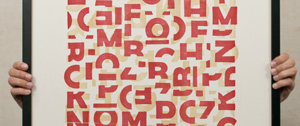
“Serendipity” is an invention, a lucky finding result of chance that occurs when the objective is very different. Perhaps that should be the title of these compositions: “Serendipity in red (or blue)”, since it emerged by accident while reproducing a wood alphabet in the workshop of the Elisava School –and by technical issues that do not come to the case– some pieces came out severed and apparently unusable.
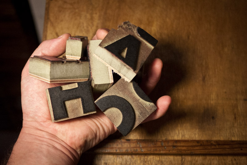 The wood alphabet in question was composed of different letters of the “Bernhard Negro” typeface, created in 1930 by the german artist and designer Lucian Bernhard for the Bauer Type Foundry. A sans serif and very dense typography, whose vertices –slightly rounded and irregular– allowed an optimal reproduction using systems of numerical control milling.
 The truth is that the beauty of those letters, even mutilated, led me to attempt an unlikely composition that I hardly could have imagined without that accident. A composition now reissued in a larger format thanks to the generosity of Arnau Estela (l’Anacrònica) who occasionally –and if I behave– allows me to enjoy his wonderful Korrex Hannover of 1964.


 A series with two versions (blue and red) numbered and signed.
Manually printed in two runs and two inks on paper Fedrigoni Materica Gesso. Size: 19 ¾ x 27 ½ “(50x70cm.)*. Available in BunkerType store.
A series with two versions (blue and red) numbered and signed.
Manually printed in two runs and two inks on paper Fedrigoni Materica Gesso. Size: 19 ¾ x 27 ½ “(50x70cm.)*. Available in BunkerType store.


*All compositions fit in IKEA frames. Strömbi model in black color is recommended.
Available in BunkerType store.